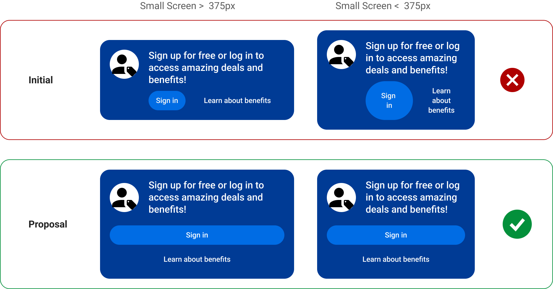
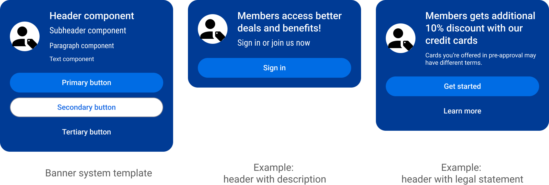
Authentication Banner System Design
A scalable authentication entry system that standardized access patterns across 1,000+ pages.
Impact
- Localization runtime: 120h → 3h
- Design-to-dev cycle: 4 weeks → 1 week
- Same-day publishing via CMS
- Zero engineering support for routine updates
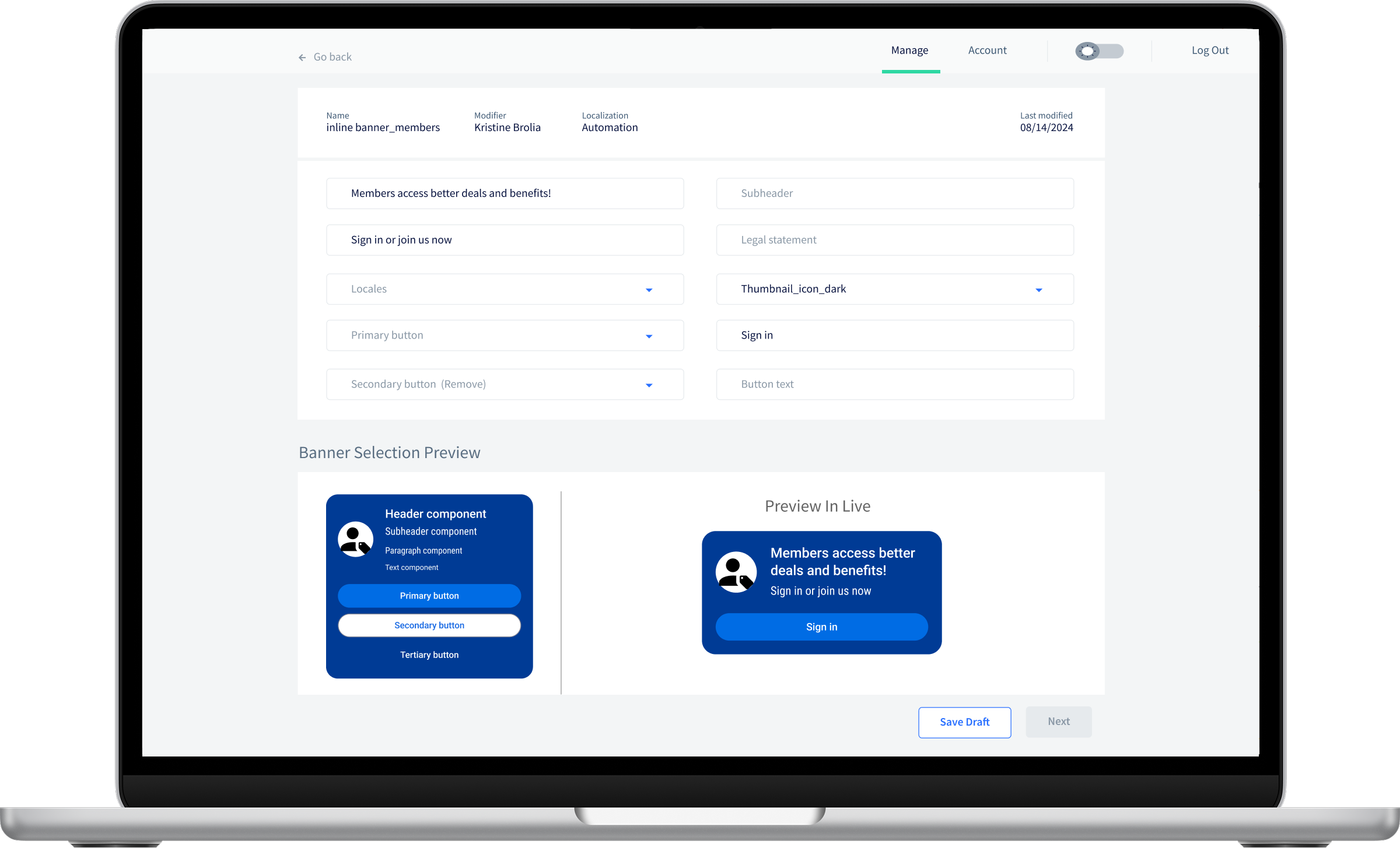
Illustrative example only. Not a final or production UI.